WishStash
Pinterest-for-products consumer application
Pinterest-for-products consumer application
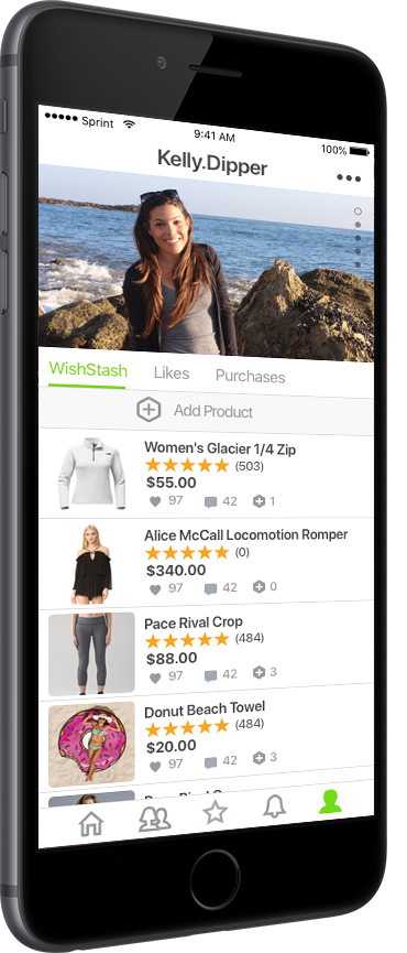
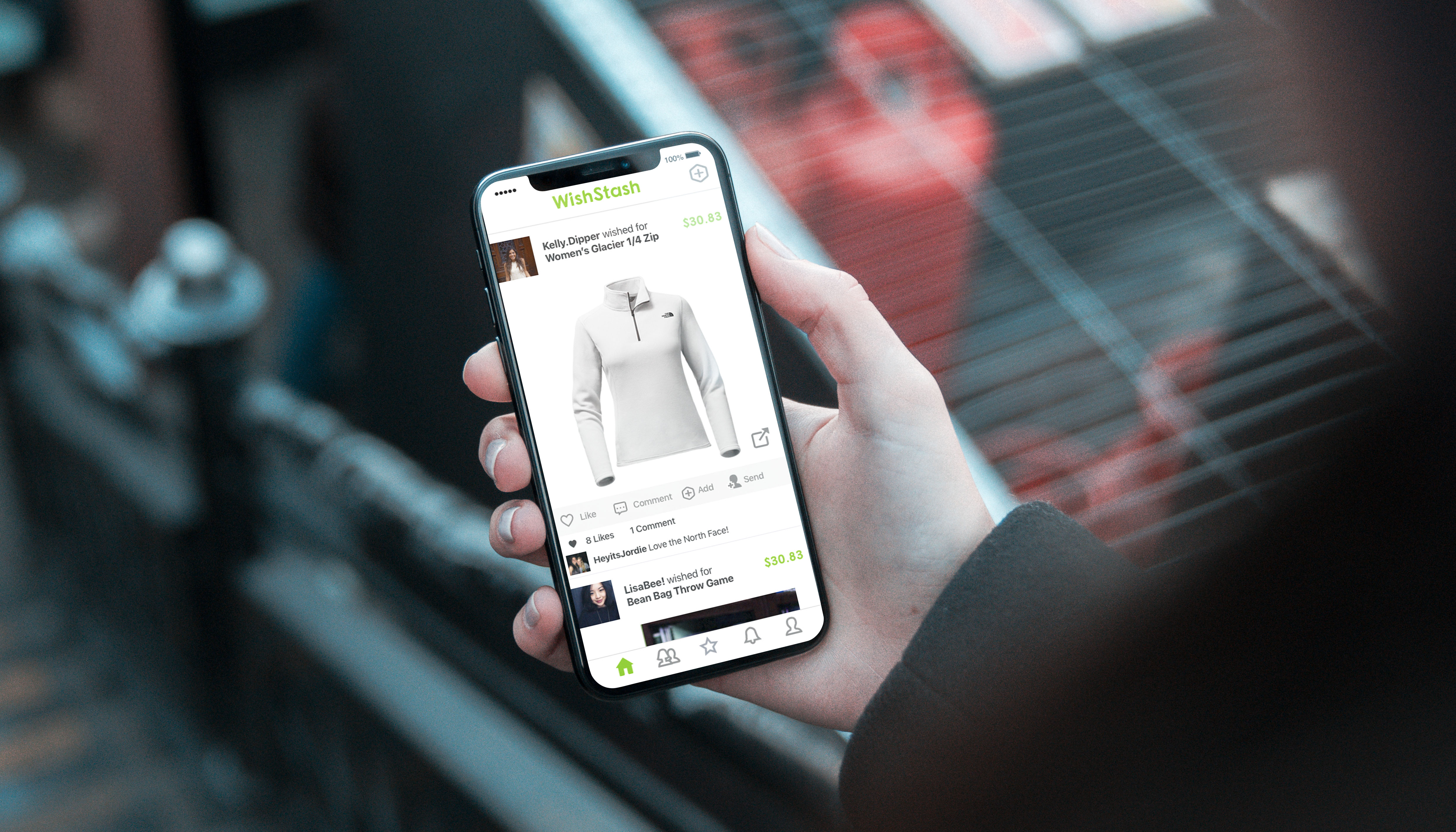
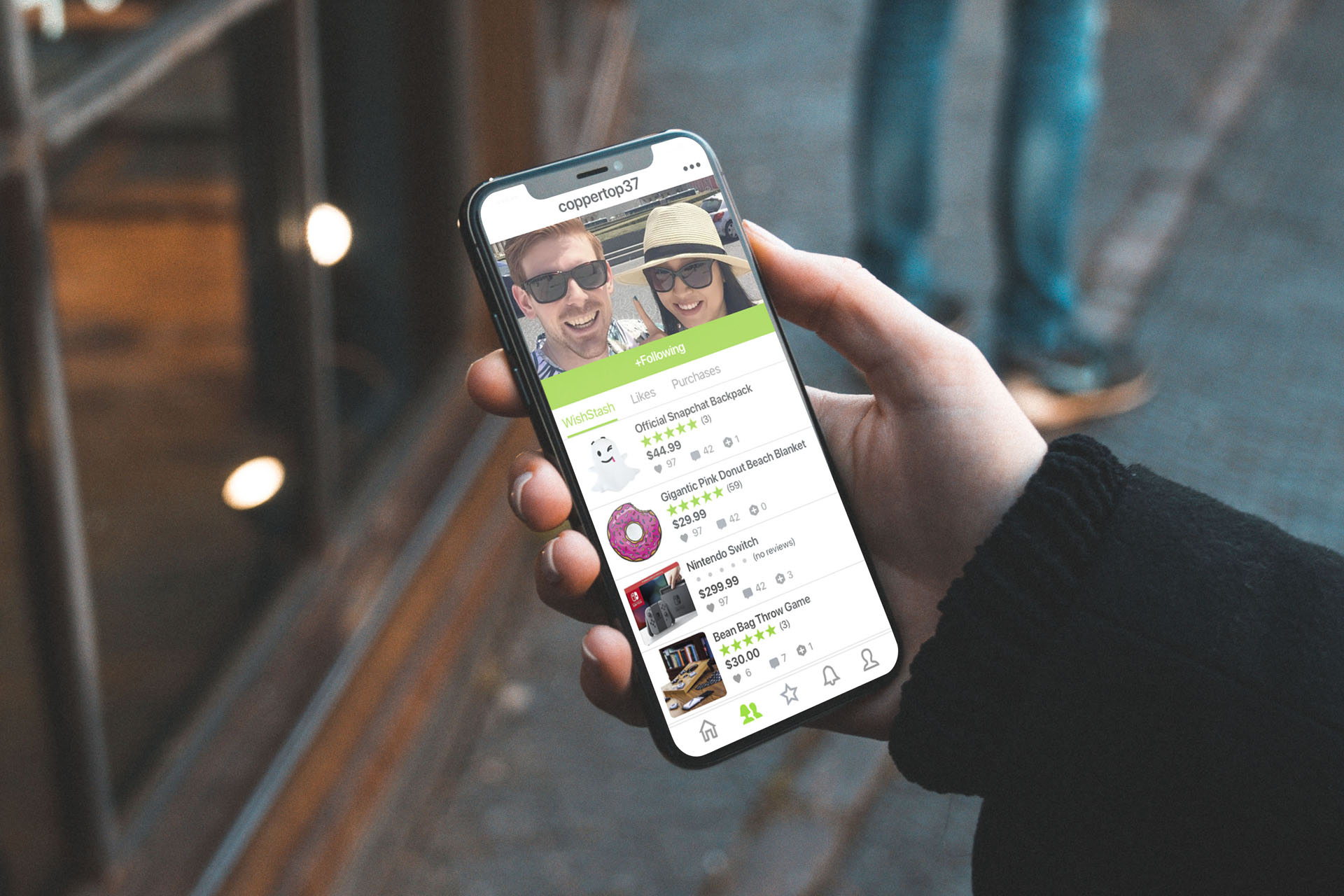
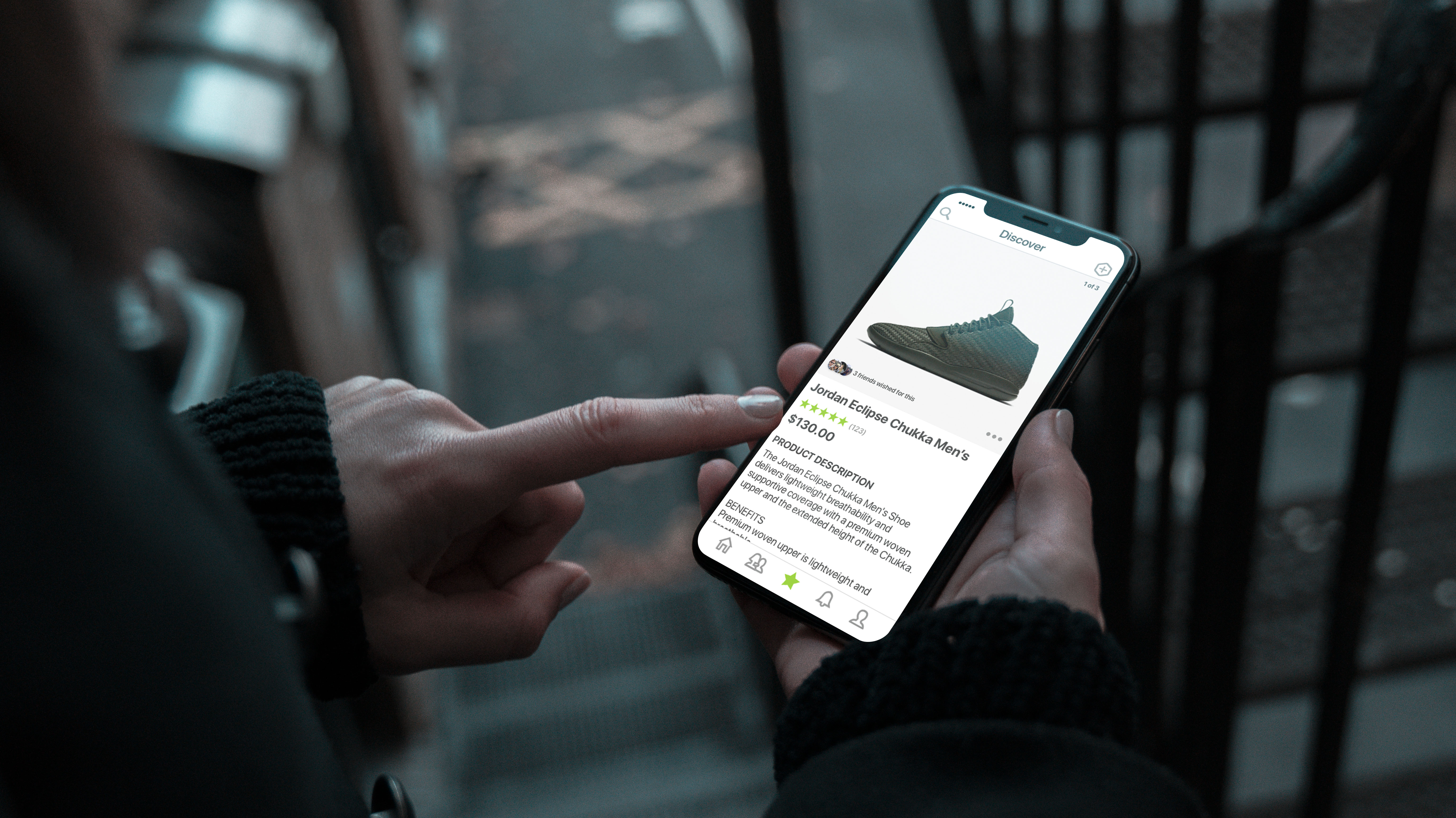
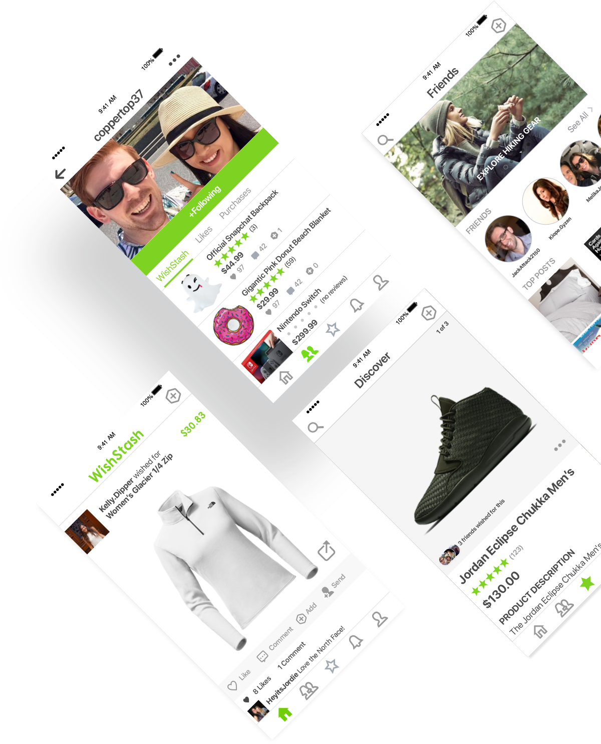
WishStash is a pinterest-for-products application for iOS and Android. Our algorithm finds products you would like based on your interests and social network.
How might we help users discover awesome new products and make shopping social?
WishStash was designed in Sketch for a mobile experience. All UI components and libraries were built from scratch. Photoshop was used for image cropping and device mockups and Word was used to gather inspiration and notes during the research phase.
I believe in user-centric iterative design. Here is a breakdown of the design process I used for WishStash.
The concept of WishStash came out of a personal pain point of online shopping.
Next up was research of user needs and curent solutions in the marketplace. I also gathered inspiration for UI and Product Strategy from existing commercially successful, large-scale apps with proven business models.
Once the general idea of the app was ready, I began creating a UI library and mockups from scratch. A design language was formed. I also tested multiple different logos and typography before settling on the final branding guide.
The idea of Wishstash came from a personal pain point: not being able to
find good products easily. Often times I would be browsing Pinterest, only
to discover dead links, discontinued products, or images with no product at all.
For me, it was frustrating to search endlessly for quality products that were aesthetically pleasing.
In-person shopping was even worse, as stores have limited inventories and are often overpriced
compared to what you find online.
Ultimately the idea boiled down to an app that uses an algorithm to find products you would love: similar
to how Pinterest's algorithm would find a pin that fits your interests. The difference is that Wishstash would
be purely product-driven and not just for inspiration.
The next step was researching the marketplace for existing solutions and gathering design
and user-flow inspiration from proven business models. I struggled to find similar apps in the
marketplace other than "Wish". Wish had a similar idea but the selection and quality of products seemed rather
poor. This led me to realize that the best approach may be a user-curated experience where users submit content
and products they love- similar to certain subreddits and Pinterest. The overall user experience of Wish also felt
rather spammy to me, as you are immediately brought to a page with tons of cheap products you may or may not have any
interest in. This pushed me to consider creating an onboarding experience or integration with an existing social
networks to gather data on a user's existing interests.
I also considered the format of the app. How would users find products they like? Would it be a window-shopping
experience like Pinterest or Amazon, where the user could scroll through hundreds of products? Or would it be more
like a Tinder experience, where the user would get matched with one product at a time and swipe right or left?
I also played with the idea of making the app social. Perhaps you could see a feed of products your friends were
interested in? This would hopefully help the user find products they would like themselves, or give them ideas
for what to buy their friend for their upcoming birthday or Christmas party.
Finally I took a look at what needs the user would have. A few key items took priority when product-hunting:
Once the user goals were established, I set out wireframing and creating user-flows on paper.
I then designed the logo and chose typography and colors. A few different color schemes were tried.
Originally I chose an orange and black theme but those colors did not really compliment the product
identity as well as green and charcoal with neuteral colors.
Next I created a design library, interplaying organic and non-organic shapes. I decided tot use modular
shapes for products and organic shapes for social elements. Modular shapes allowed the user to see
more of the product while organic shapes gave a more human feel to the app.
Once the designs were completed I also gathered feedback from family, friends, and other designers to
iterate on the concept and improve the app.